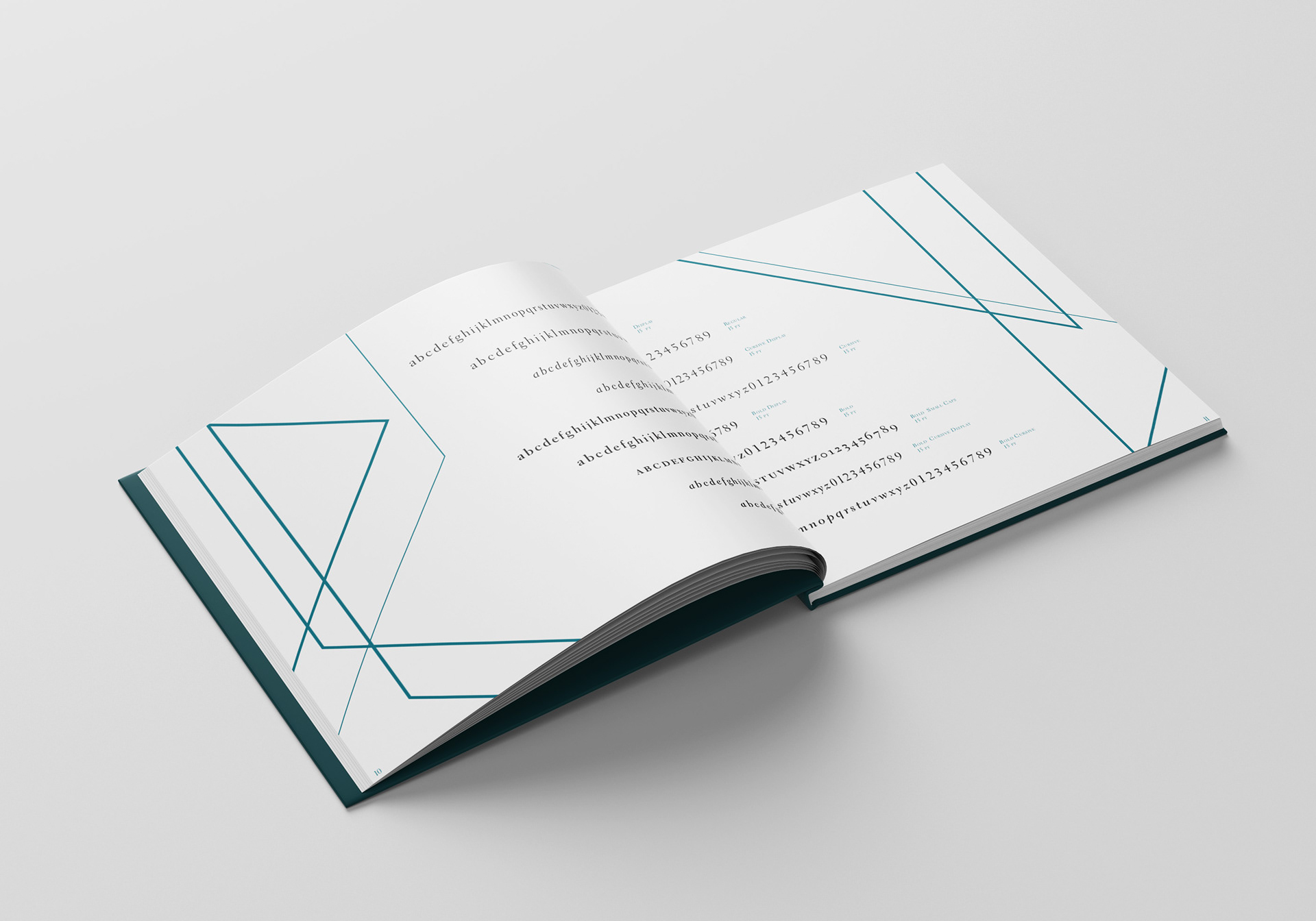
Electra Font Book
PERSONAL PROJECT
Typography & Layout Design
The following is a font book layout project that draws a direct comparison between the typeface Electra by William A. Dwiggins and the play Electra by Sophocles. The varying sizes and weights of the font are assigned to specific characters and they interact with each other throughout the story, while simultaneously featuring the different aspects of the font Electra. The color palette is simple and effective; it presents the font as the focal point. The line details move your eye across the page, drawing your attention to certain characteristics of the font, while also illustrating scenes in the story by interacting with the letters. A good example of this is on page twelve when the lines form sharp points and appear to stab the C of Chrysothemis and the A of Agamemnon. Both letters lay sideways on the bottom of the page to personify the characters that are killed in the play.


Interested in working together?